My Technical Notebook expanded from the pages in John Parker CERAMICS
Contents
COLOURED GLAZES 1971―73 and 1977
PITTED/VOLCANIC/LAVA WARE 1971―73 and 1977 and 2015+
INTRODUCTION
This Notebook is intended to explain the context for my conceptual ideas, influences, sources and processes; and provide technical information about my making and glazing techniques. Facts are from the various notebooks I have kept over the years and also from memory, which is dangerous, but as honestly accurate as I can make it.
The glaze formulas are replicated here exactly as they were recorded in my notes. Because of ongoing modification, the quantities of materials are often no longer percentages (that is, formulas may not add up to 100). Materials may also have changed since the recipes were formulated with changes to supplier or mining source. Gerstley borate for example is no longer available, neither are white nor red lead.
As with using all published formulas, it is imperative that you test the recipe first. Glaze materials, clays, water source, application techniques and firing methods vary from location to location and person to person. Each variable produces its own flow-on effect. What worked for me, worked for me at the time I did it.
All glazes are sieved through 100 mesh sieves and are mostly sprayed on.
With the exception of bisque or specialist firings, all my firings are standardised at the climb rate of 150°C per hour because this is the rate at which the large pyrometric cones are calibrated. (Cones measure heat work rather than specific temperature, so the rate is crucial.) I never soak at top temperature except with crystal glazes where soaking, while cooling down, at around 1000°C for a number of hours can aid large crystal growth. This standardised rate originated from a Middle Fire Glaze course I taught at the Auckland Studio Potters Centre, where we all tested the same glazes in our individual kilns. The variations from the same bucket were astronomic until we standardised the rate and soak time.
Bisque firings—especially of my later, much thicker, grooved work—need to be of absolutely bone-dry pieces to fire at 150°C per hour to 1000°C. Water can't boil inside solid clay. It just makes the clay explode. However, if desperate, I can fire just turned leather-hard wet pieces by a slow climb of 15°C per hour to 95°C, followed by a five-hour soak with all the spy holes open. The water evaporates before it boils. Then I complete the firing at the usual 150°C per hour up to the final temperature.
All pre-London work was thrown on a home-made Leach kick wheel. After 1977 I have used a couple of Talisman electric wheels. I currently fire in two Elecfurn kilns: a 5.1 cubic foot top loader and a 15 cubic foot side door.
EARLY WORK 1966-1973
My parents were ex-farming working class. My father drove petrol tankers for Mobil and my mother made electric fence shock units. They indulged their only child. The wood shed became my first studio.
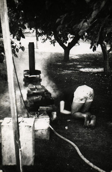
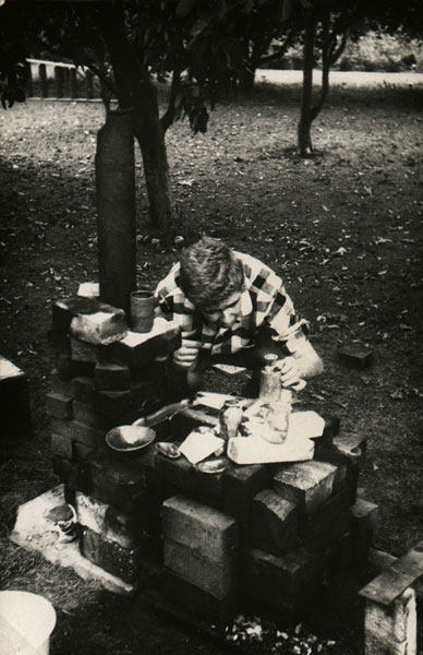
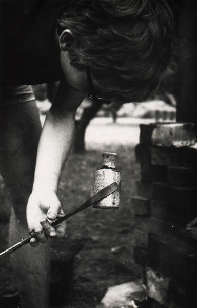
My wheel was a home-made version of the Pantheon of Wheels—The Leach Kick. It had a galvanized tin, soldered drip tray. My first kiln was an up-draught wood-fired raku affair. This was augmented with the ubiquitous vacuum cleaner blower to actually achieve some sort of melting temperature of 700-800°C. The glazes I used were straight out of Bernard Leach's A Potter's Book.
|
| |
| White lead | 66 |
| Quartz | 30 |
| China clay | 4 |
|
| |
| White lead | 66 |
| Quartz | 30 |
| China clay | 4 |
| Copper carbonate | 16 |
This produced the very new, reduced copper, metallic luster effect, which was to haunt raku until Rick Rudd in the mid-seventies did something about taking it seriously as a medium. Back then one had raku parties and drank tea out of hot recently fired cups, raw lead and all.
My favorite glaze was:
|
| |
| White lead | 42 |
| Lead bisilicate frit | 42 |
| Manganese oxide | 8 |
CONE 10 REDUCTION FIRED STONEWARE
I built, with Grant Hudson, my first two-chamber down-draught kiln, in my parents' backyard. The kiln was designed after I stayed with Barry Brickell, and it followed a sort of Roy Cowan plan. The aim was to fire natural-draught, dribbling diesel down the front surface of a brick in the fire box, with all the resulting smoke, smut and pollution. In a residential area, that didn't last for long. Inevitably came the trusty Tellus vacuum cleaner motors as blowers, and a much cleaner firing method. I first used Neil Grant's burners, but settled in the end for Teddy Twiss' masterpieces. Firings took around twelve hours and the quality of the clay and glaze was as you would expect from a reduction fuel kiln.
CLAYS
In the beginning I used any clay I could get. For a time I used Peter Stichbury's mix, but then settled for this one:
| SN1 | 80 |
| Crum Clay | 80 |
| White Ball Clay | 20 |
| Silica Sand | 10 |
SN1 was a white firing, dry powdered clay from Commercial Chemicals (which eventually became C.C.G. Industries). Crum clay came as a plastic clay from Crum Brick and Tile in New Lynn, Auckland, and was generally used for drainpipes and flowerpots. When fired, this clay became quite creamy and pale like the commercial Denby ware and it took oxides well. I often added 10% grog to the clay to give a ripped texture as a result of the throwing process.
I also used commercial white earthenware clay that was intended for jiggering and jollying and consequently was not very plastic or wheel-friendly, but it fed my interest in white clay.
PRINCIPAL GLAZES
|
| |
| Feldspar | 40 |
| Kaolin | 30 |
| Whiting | 20 |
| Silica | 10 |
|
| |
| Cornwall Stone | 85 |
| Whiting | 15 |
|
| |
| Barium Carbonate | 60 |
| Nepheline Syenite | 130 |
| Kaolin | 14 |
| Lithium Carbonate | 4 |
| Copper Carbonate | 10 |
|
| |
| Feldspar | 56 |
| Kaolin | 28 |
| Whiting | 4 |
| Dolomite | 26 |
| Cobalt oxide (Pink) | 0.5 |
| Cobalt oxide (Purple) | 5 |
|
| |
| Chromium Oxide | 44 |
| Red Iron Oxide 44 | 28 |
| Manganese Dioxide | 10 |
| Cobalt oxide | 2 |
This is not exactly a glaze, but rather a combination of oxides. The fluxing properties of the iron and manganese react with the fluxes in the clay, producing a graphite-like sheen similar to coke.
HANDBUILDING 1969-1973
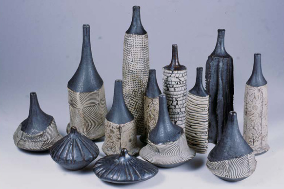
The pieces were made following the Len Castle method of texturing a solid block of clay and then cutting it in half, hollowing out and then rejoining the halves. The necks were coiled and pinched around a thin paintbrush handle, then scraped and shaved with metal kidneys, potato peelers and a special knife with a long thin parallel blade made from an old hacksaw. After bisque firing the inside was glazed, and then more glaze was brushed into the texture and wiped off where desired. Then the rest of the piece was glazed.
Love Potion Bottles
I discovered Wagnerian opera through an early interest in stereo equipment. A friend, Bruce Graham, bought the Decca box set of records of Solti's Seigfried, but had no turntable. The Love Potion Bottles refer to Wagner's Tristan und Isolde, where the lovers think they are taking a death draught to end their impossible love in a dual suicide pact. But the poison was replaced by a love potion. The words are the German text of the famous Liebestod—the love duet climax Isolde achieves on her own over the corpse of Tristan.
Morris Bottles
The texture of these bottles was made from directly pressing the clay onto Victorian glass door windows. I was trying to create a version of William Morris wallpaper. Smith and Caughey’s had a Sanderson wallpaper sample catalogue of William Morris designs I used to drool over.
Concentric Bottles
Here the texture was made with a rubber rocker, intended for making artificial wood-graining as a paint finish.
Cut Bottles
The fluting of these bottles was cut from the solid slab with a wire turning tool.
Coiled Bottles 1973-77, Royal College of Art
The appeal of hand building continued for me as a foil to wheel throwing. The coils on these bottles were left to show the skeletal structure and demystify the making process. This led to the first thrown "coiled" work which, in turn, ultimately led to Vortex Ware.
Nixon and Laird Bottles
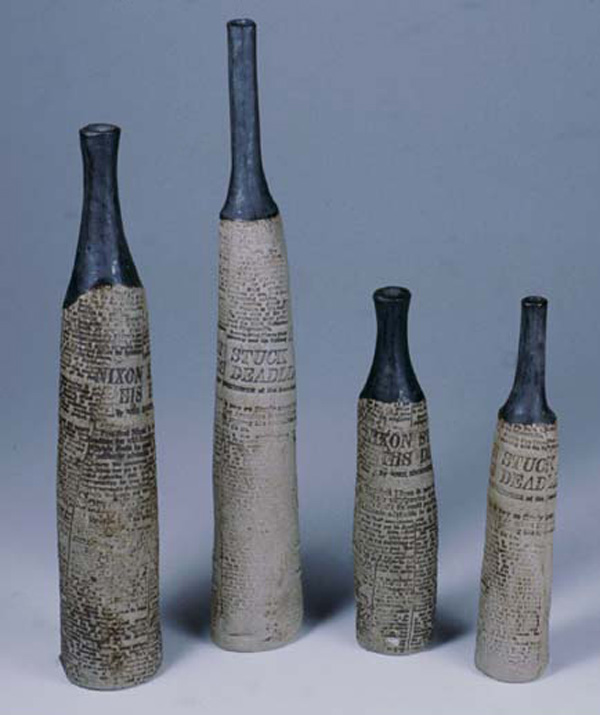
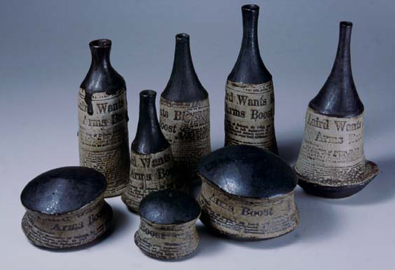
These bottles were textured by rolling them on the plaster cast of a printer's mat that included an item about Nixon and one about Laird. The mat (pre-word processor) was the flexible mould taken from a flat composited page of metal linotype, which was used to cast a zinc sheet that could be fixed around a roller to print newspaper. (The Nixon Bottles were tall because the Nixon reference came near the top of the page on the plaster slab, whereas the Laird texture came nearer the bottom.) I guess they were political—it was 1971-72 after all. I wasn't.
AGATE 1973
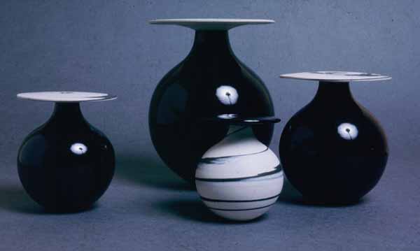
I don't draw well at all—most of my decoration has to do with the action of the wheel. So agate is of particular interest to me because it has an archaeological quality of showing you where the clay has travelled, like a time-lapse photograph.
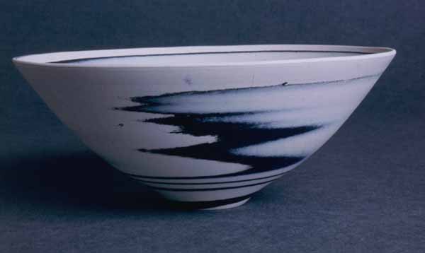
The essence of agate is to take two or more different clays, wedged separately to get the air bubbles out, and then to carefully place the clays together without trapping air. The new combined lump is then placed on the wheel and thrown as usual. There are a huge number of different possible effects. Firstly, the proportions of the lets say two colours, black and white, can give dominance to one colour. Secondly, the placement on the wheel is important. Colours can be placed side by side, on top of one another, or as spots around the side and so on.
Throwing agate usually produces spirals as the agate actually documents the rotation of the top rim of the piece in relation to the clay at the bottom that is attached to the wheel-head. It is important to throw as quickly as possible because the two clays can get intermixed very quickly—although this can create another effect. Tricks like deeply digging in your fingers and then smoothing out flat can give zigzag lines. Sometimes you have to throw really badly at the beginning to get the colour placements correct.
As you throw, the piece gets covered in a combined slurry of the different clays. When it is leather-hard, turning reveals the agate stratification—or frequently the lack of it. You end up with a lot of clay turnings that are a mixture of the differently coloured clays. In my case it was grey.
The final stage is burnishing the piece on the wheel, using a metal kidney flexed flat against the clay under pressure. Sometimes it is necessary to use a light mist spray of water to help the burnishing.
The bone-dry pieces were once-fired to 1220°C. In the firing the burnished clay tended to roughen up again because of the activity of the body fluxes. The pieces were then smoothed and polished with water using automotive wet and dry carborundum paper.
CLAYS
The basic clay was white firing David Leach/Podmore Porcelain. To this I added 10% stain or an oxide like copper carbonate. It is easiest to mix the stain or oxide with a little dry clay and water and then sieve it onto the weighed out balance of clay before wedging. The clay needs to be of an even consistency.
The exceptions to this include the addition of texturing materials like 2-5% brass key cuttings for reactive copper spotting on pieces that are intended to be bisqued and glazed. The agate technique mixes the fortified clays in random ways that are impossible to achieve with a brush. The clays disappear beneath each other, resulting in subtle gradations of colour that affect the cover glaze.
For another series of work I added 10% molochite (refractory grog made from vitrified kaolin which is used in non-slip paint for pedestrian crossings) that Warren Tippett gave me. The result in different agate clays was a white speckle—like a sandstone-concrete effect similar to Terrazzo benches.
INLAYS
When the outside of a bowl, for example, had great agate and the inside had little, I often inlaid pink, yellow or blue clay lines to balance the proportions.
Rodney Fumpston introduced me to pink. In the mid-seventies in London he made a print series, Sky Marble Arch, using embossing and graded colour rollups on the zinc printing plate. The rectangular images were a response to the areas of sky observed between tall buildings and the ever-present Northern Hemisphere jet trails. I got involved with blue on blue agate with pink inlayed squiggles as 3D versions of Rodney's works on paper. They have been, I think, my only attempt to suggest realism by painting pictures.
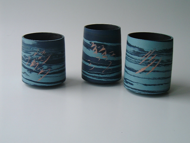
At our Royal College of Art Degree Show, the Ceramics Department played Bryan Ferry's Hard rain's gonna fall. Auckland friends later referred to it as "fairy music", so when the In Your Mind album was released, I made a defiant series of five agate pieces on plinths based on lines from songs. I later made ten pieces based on the Ken Russell film Valentino, which were less successful because I was trying to be clever. There were five good ideas spread thinly over ten works.
Rodney had produced a Learning Etching series of prints for teaching purposes as examples of every kind of etching technique. The Bryan Ferry and Valentino pieces similarly told you "everything you ever wanted to know about agate"—if you knew how to read the examples.
THROWING METHODS
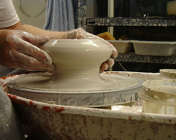
Throwing is really simple and straightforward with practice. It helps if you prepare the clay thoroughly. Bernard Leach said somewhere that you need to spiral wedge the clay at least 100 turns to get an even consistency and to rid the clay of air bubbles. I am a stickler for counting, and do 150 with the finer clays which annoyingly love to retain their trapped air pockets.
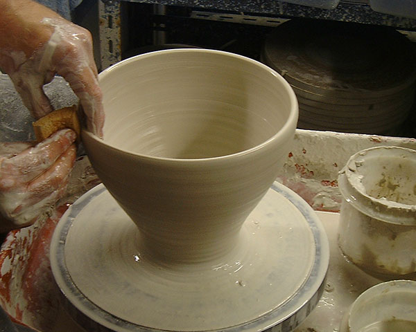
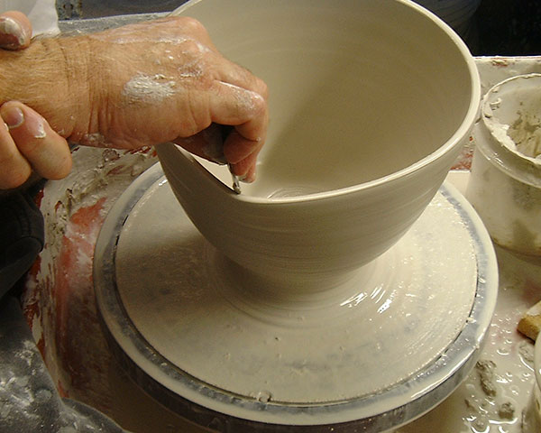
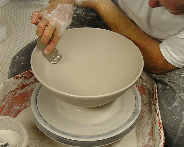
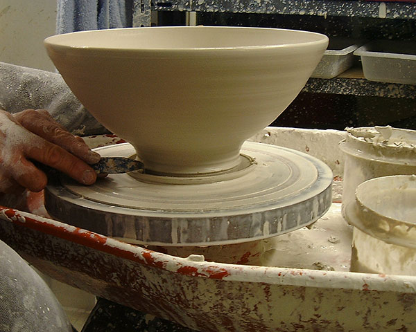
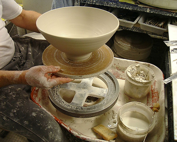
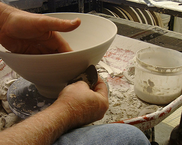
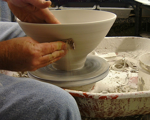
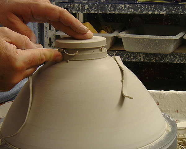
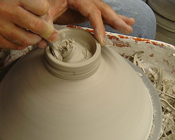
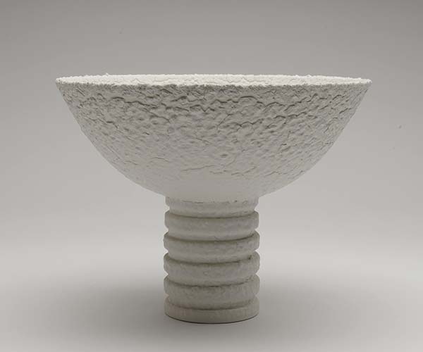
I am much better at turning than throwing, so I tend to make thick blanks. This is especially so with my later grooved pieces, which can then be turned very deeply into the surface.
It helps to put the clay where you need it. For a bowl I centre the clay as a mushroom, rather than the textbook cone shape so that I am using most of the clay up in the bowl. I open out the piece using plenty of water, and then finish it by stretching dry using the fine edge of a metal kidney to ensure absolutely minimum contact with the clay.
When the piece is leather-hard, I begin turning with the piece placed as it was thrown and then invert it for the foot ring. I turn every surface.



DECALS 1973--1976
At the Royal College of Art I had the opportunity to play around with ceramic transfers for the first time. Commercially available sheets had everything you had ever wanted, from Gainsborough figures to Liberty print forget-me-nots. My favourite was the sheet of exotic butterflies. The large home-made butterfly on the outside of a house is a New Zealand folk art icon that engendered homesick connotations of the brick and tile quarter acre section with vegetable garden and a rotary clothesline. I was being smart and clever, flaunting in kitschiness, revelling in living in London and getting off on the outrage of it all.
While playing around with the industrial thing, I got into banding fine silver lines on bone china, like a factory worker. My favourite film of all time, The Devils, was made by one of my great mentors and inspirations, the British film-maker Ken Russell. Peter Maxwell-Davies wrote the score and Derek Jarman was the production designer. Russell takes great risks. I admire an epic disaster more than a mediocre safe success. The movie was shown here in a modified version in 1972 so as not to affect the moral climate of New Zealand. I saw the longer, but still heavily cut, print in London. I await the full length Director's Cut DVD.
The Devil's Food Cake Plates came out of this fusion of Wedgwood and Royal Doulton with the silver screen. The decals were made in the Royal College of Art printing workshop, using on-glaze enamel instead of black ink. The artwork came from a set of production stills I had acquired in a movie flea market.
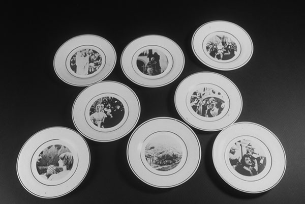
The printed image was floated off in water (like a normal decal), applied carefully with a rubber kidney to get out all the trapped water and air, and then fired to 900°C. The enamel fuses and sinks slightly into the glaze. The same photographic process is used to put photographs on cemetery headstones, especially in West Auckland.
WORKS IN PROGRESS 1996
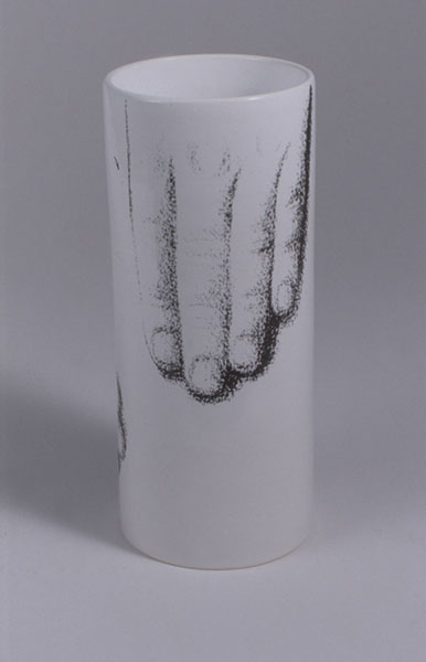
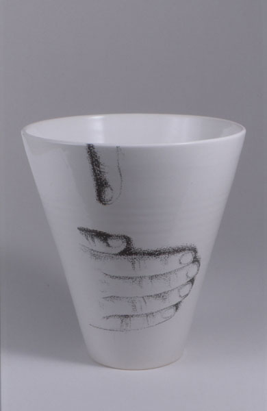
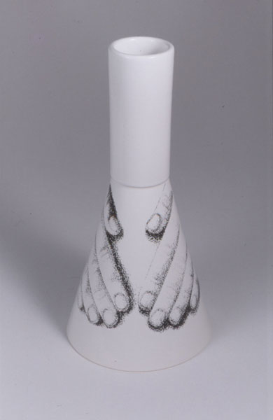
I had worked on collaborative pieces with Terry Stringer before. The concept for a new show at Compendium Gallery was to photograph my hands as I made the work on the wheel, then make drawings and finally decals of the life-sized drawings. The blank pieces were then fired and glazed like white commercial ware. The decals were applied with my hands in the positions of throwing the pieces. Works in Progress was in its own way a "How-to-be-a potter-in-ten-easy-lessons" series. Manufacture and firing of the decals was similar to The Devil's images.
BRONZE
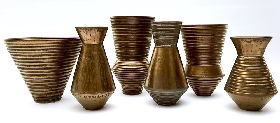
My first copper/manganese metallic glaze effect came by accident at the Royal College of Art in 1974. I had been trying to duplicate the 1300°C Reduction Fired Matt Black glaze in the oxidised atmosphere of an electric kiln at 1220°C with poor results. A test involved painting a copper carbonate spiral over manganese dioxide. The edges of the brush stroke went gold—it was like alchemy. It appealed to me because it was just a mixture of oxides like the old Matt Black.
So for years after that discovery I banded three layers of manganese and added stationery Gum Arabic to make it flow and set. Then I floated a transparent wash layer of copper carbonate which was also mixed with gum.
In 1987, Tony Birks' book, Lucie Rie, gave the following version of this glaze:
|
| |
| Manganese Dioxide | 80 |
| Copper Carbonate | 20 |
I still add gum and apply three or four layers of the mixture, grading it up from the foot because it is very prone to running. It needs to be thick enough to just obliterate the text when you brush it on newspaper. The glaze is tricky and varies with no apparent reason. Applied too thickly it goes black silvery khaki. But when it works it really works.
|
| |
| Cobalt oxide | 40 |
| Talc | 50 |
| Borax Frit | 10 |
To enhance the texture I sometimes used the stain like a standard wash—applied thickly and then sponged off in gradations. This is similar to inking a printer's plate.
CLAYS 1977 to the present
By the time I returned to New Zealand from London, I had completely altered my thinking to working exclusively with oxidised firings in an electric kiln to 1220-40°C.
I found the David Leach Porcelain I had used in Britain was now available. It was very expensive, but I could continue with agate and get similar results to the work I had made at the Royal College of Art. I used a Steve Rumsey mix for a while for general work, which was very similar in fired quality to the old SN1 clay mix.
I variously used Abbots' Red, Terracotta, and then Abbots' White, then settled on Mac's Mud, first manufactured by potter Royce MacGlashen and then by Waikato Ceramics.
Currently I exclusively use the Decopot Mid-Fire Porcelain from Paul Pepworth in Palmerston North.It is an excellent Cone 6 range white firing porcelainous clay that is relatively plastic for a pure clay.
VORTEX WARE
The following article was published in the New Zealand Potter magazine (vol. 23, no. 2, Spring 1981, pp.24
Photograph by Peter Shaw
" DOMESTIC WARES
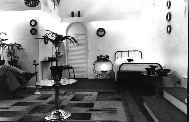
A little known Auckland Pottery Factory,The Vortex Works, was a rival to Crown Lynn hand thrown ware in the mid nineteen-fifties.
The Works, dating from around 1947, was a small owner operated business, sited first in Mt Albert and later moving to the Waiatarua area.
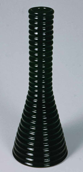
All the work was made by the owner from one clay source. The stylistic features of Vortex Ware are a single shiny glaze on simple forms with most surfaces being a heavily tooled ridging reminiscent of "coil" pottery.
Vortex Ware was purely utilitarian, featuring ashtrays, cigarette boxes, planters, vases, flower troughs, bowls and pineapple stands—all indispensable in the modern home.
The work was relatively unnoticed in its day, as was the recent retrospective exhibition at Alicat Gallery, which presented the pieces in their appropriate lounge and sick room settings.
The Vortex Works had a limited output. Pieces are now eagerly collected for their rarity, and may have found their way into at least one important public or private collection somewhere in the world.
However, would be collectors should be wary of fakes.
John Parker "
Vortex Ware Conical Flask (2010)
The Vortex phenomenon was a hoax. Most of the references in the New Zealand Potter article have only some loose factual basis. For instance, I was born in 1947, and I used Dianne White's kiln in Mt Albert, Auckland prior to moving to Bush Rd, Waitarua.
I have always been interested in industrial wares. It comes from my chemistry set background—the bone china evaporating dishes were my first fascination for their translucency. I began collecting Crown Lynn around 1972, almost as a reaction to the brown and green, truth to materials, cone 10 reduction tradition I had evolved through. To a "real" potter, Crown Lynn was at that time an insult, implying moulding, casting and machine-like precision—everything freedom of expression in clay was not. Yet they had Hand Thrown printed on their bases.
The idea for a hoax exhibition at Peter Sinclair's Alicat Gallery in Auckland came from a scandal that had rocked the British penal and pottery systems. Prisoners attending pottery classes as therapy had made fake Bernard Leach pots complete with his "authentic" seal. I think they were sold at Sotheby's.
I still get genuine calls wanting more information about the history of the Vortex Works factory.
CONSTRUCTION METHODS
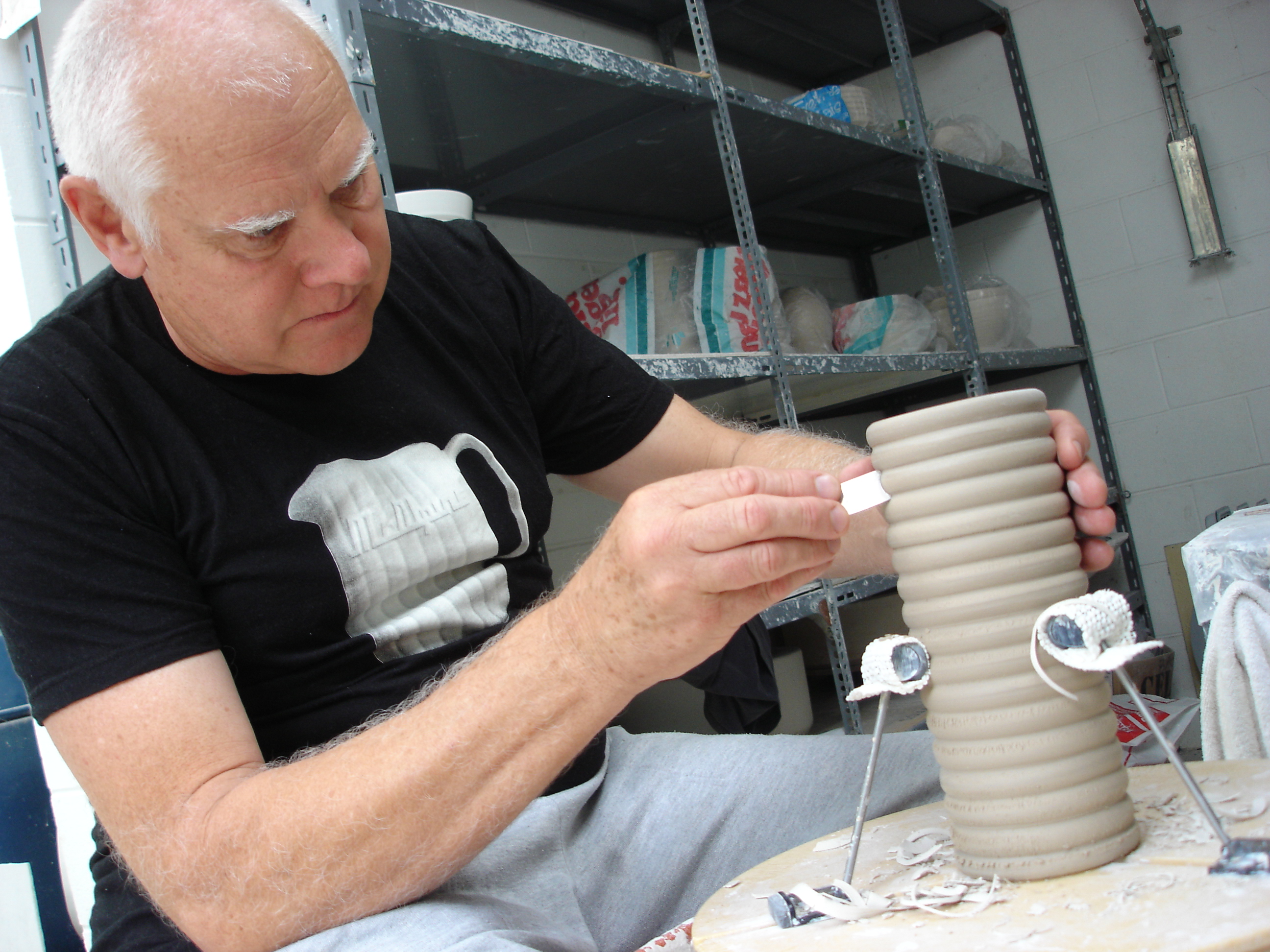
The pieces were all hand thrown and turned. I use the usual wire and metal tools for turning, but have made a notched third round profile to turn each of the coils separately. In this way the pieces can be positioned with some tolerance as I work, to compensate for the different shapes.
|
| |
| Feldspar | 4.5 |
| Kaolin | 20 |
| Whiting | 5 |
| Gerstley Borate | 9.75 |
| Copper Carbonate | 3.75 |
| Manganese Dioxide | 3.75 |
| Cobalt Oxide | 2 |
|
| |
| Abbotts' Clear glaze | 90 |
| Mason Black stain 14E44 | 10 |
This revised glaze is more mirror black than the original, which had more of an opaque texture consistent with using a combination of chemical oxides to produce black, rather than a commercially prepared stain.
COLOURED GLAZES 1971--73 and 1977
Cadmium Selenium Red and Cadmium Selenium Yellow
These vibrant technicolour glazes are commercially available. The pieces are high bisque fired to 1150°C, as with traditional industrial earthenware, then glazed and fired to 1060°C. Because they are virtually non-porous the glaze takes a while to dry. Application is aided by the addition of a slurp of neutralised acid (10% hydrochloric acid) which helps keep the glaze in suspension. The kiln needs to be well ventilated.
There was a Cadmium Selenium Lime Green that was very sexy, but it has been discontinued.
GLAZES FOR OXIDISED FIRING to 1220°C
|
| |
| Soda Feldspar | 35 |
| Standard Borax frit | 23 |
| Barium Carbonate | 8 |
| Whiting | 8 |
| Kaolin | 8 |
| Silica | 18 |
| Yellow Stain | 10 |
|
| |
| Abbotts' Clear glaze | 100 |
| Yellow Stain | 20 |
|
| |
| Abbotts' Clear glaze | 100 |
| Yellow Stain | 10 |
| Lime green Stain | 15 |
|
| |
| Abbotts' Clear glaze | 100 |
| Pink Stain | 15 |
| Frit 3124 | 50 |
|
| |
| Abbotts' Clear glaze | 100 |
| Yellow Stain | 20 |
|
| |
| Potash Feldspar | 50 |
| Whiting | 17.5 |
| Silica | 17.5 |
| Zinc Oxide | 25 |
| Cobalt Oxide | 1 |
As this is a classic crystalline glaze it is prone to running. I don't subscribe to the idea of firing on setters to catch the glaze runs, and then grinding the stuck bases off. Gradations of spraying help prevent running, or you can mix some of the glaze with 10% kaolin and spray the bases with a variation of the same colour to act as a brake glaze. Soaking while cooling down at around 1000°C for approximately four hours will aid large crystal growth. Substituting soda feldspar for potash feldspar creates more glassy crystals.
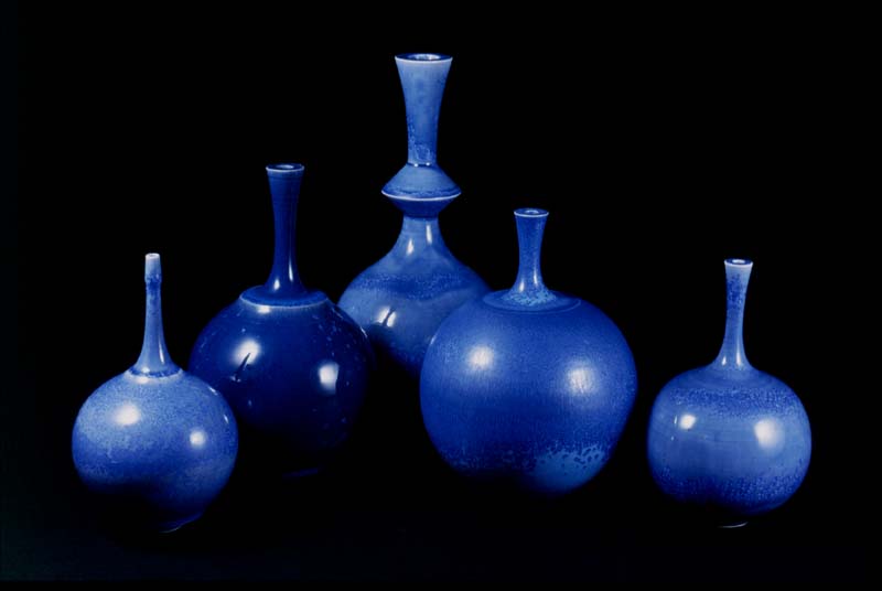
|
| |
| Lead Bisilicate | 40 |
| Kaolin | 4 |
| Silica | 16 |
| Barium Carbonate | 40 |
| Zinc Oxide | 16 |
| Nickel Oxide | 2 |
This glaze is very fluid and is prone to running
|
| |
| White Lead | 76.5 |
| Kaolin | 8 |
| Silica | 14 |
| Barium Carbonate | 40 |
| Chromium Oxide | 16 |
| Nickel Oxide | 2 |
Toxic beyond belief.
|
| |
| Barium Carbonate | 35 - 15 |
| Zinc Oxide | 15 - 35 |
| Nepheline Syenite | 25 |
| Lithium Carbonate | 5 |
| Silica | 15 |
| Kaolin | 3 |
| Bentonite | 2 |
| Nickle Carbonate | 0.5 - 3 |
The combined total of barium and zinc should be 50%. Where barium predominates the colour tends towards pink, and where zinc predominates it tends towards blue.
Josiah Wedgwood's deathbed advice: "Avoid nickel my son.
True. Nickel is the most totally frustrating and yet ultimately rewarding colouring oxide there is. It exemplifies the adage: "When it is good it is very very good, and when it is bad it is utterly rotten." You definitely need to employ the crystalline glaze brake technique with these glazes.
POLYCHROME 2014 +
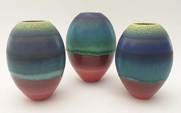
I have used coloured glazes throughout my practice, but always a complete colour field on a single piece.
With the Polychrome pieces, I am interested in the juxtaposition of unrelated colors and surfaces within single pieces.
I spray my glazes, using layering, gradation and transparency to adjacently place incompatible glazes to see their interaction through chemical reaction.
I am looking for the depth and interplay of visual vibration between colors that is seen in the work of painter Mark Rothko.
|
| |
| Gerstley Borate | 21 |
| Whiting | 20 | Silica | 32 |
| Nephelene Syenite | 16 |
| Tin Oxide | 15 |
| Chromium Oxide | .15 |
|
| |
| Soda Feldspar | 53 |
| Whiting | 16 | Silica | 5 |
| Kaolin | 14 |
| Whiting | 16 |
| Zinc Oxide | 12 |
| Cobalt Carbonate | 2.5 |
|
| |
| Nepheline Syenite | 50 |
| Barium Carbonate | 50 |
| Copper Carbonate | 5 |
|
| |
| Nepheline Syenite | 50 |
| Barium Carbonate | 50 |
| Chromium Oxide | 2.5 |
Some of the glazes are very fluid so I use an inert glaze as a kind of brake near the base of the pieces and also on the inside.
My current preferred brake glazes are the Primo Deep Glossy Red and Wine Red, Cone 6.
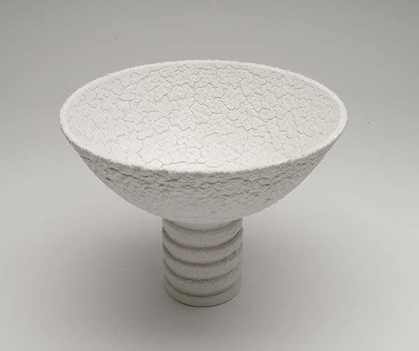
PITTED/VOLCANIC/LAVA WARE 1971―73 and 1977 and 2015+
I first used silicon carbide between 1971―73 at 1300°C in a reduction atmosphere stoneware kiln.

|
| |
| Silica | 32 |
| Whiting | 20 |
| Feldspar | 33 |
| Kaolin | 15 |
| Zinc Oxide | 15 |
| Silicon Carbide (600mesh) | 20 |
This glaze contains a ridiculous amount of silicon carbide to produce the volcanic effect, but I also used it for its greyness.

The post-London pieces after 1977 initially had the following slip banded onto the leather-hard turned piece
|
| |
| Body Clay | 100 |
| Whiting | 5 |
| Silicon Carbide (400 mesh) | 3 |
The cooking analogy is the easiest way to describe the volcanic process.
You can make toffee which is a clear liquid and then you add bicarbonate of soda and it froths to make honeycomb.
It is kind of similar with my glaze
I have a smooth glaze which is applied over a slip containing Silicon Carbide. At the top temperature of the kiln, 1220 degrees C, the Silicon Carbide releases gas and causes the glaze to bubble.When the piece cools down you have a moment frozen in time. They don't always work of course.
Using a reactive slip means you can place it where the froth from the covering glaze is not going to stick to the kiln shelf.
The next pieces are results from modifying the two Reactive Slips on p173 in John Britt's book THE COMPLETE GUIDE TO MID-RANGE GLAZES.
I substituted my Mid-fire Porcelain clay body for the Kaolin and Ball Clay.
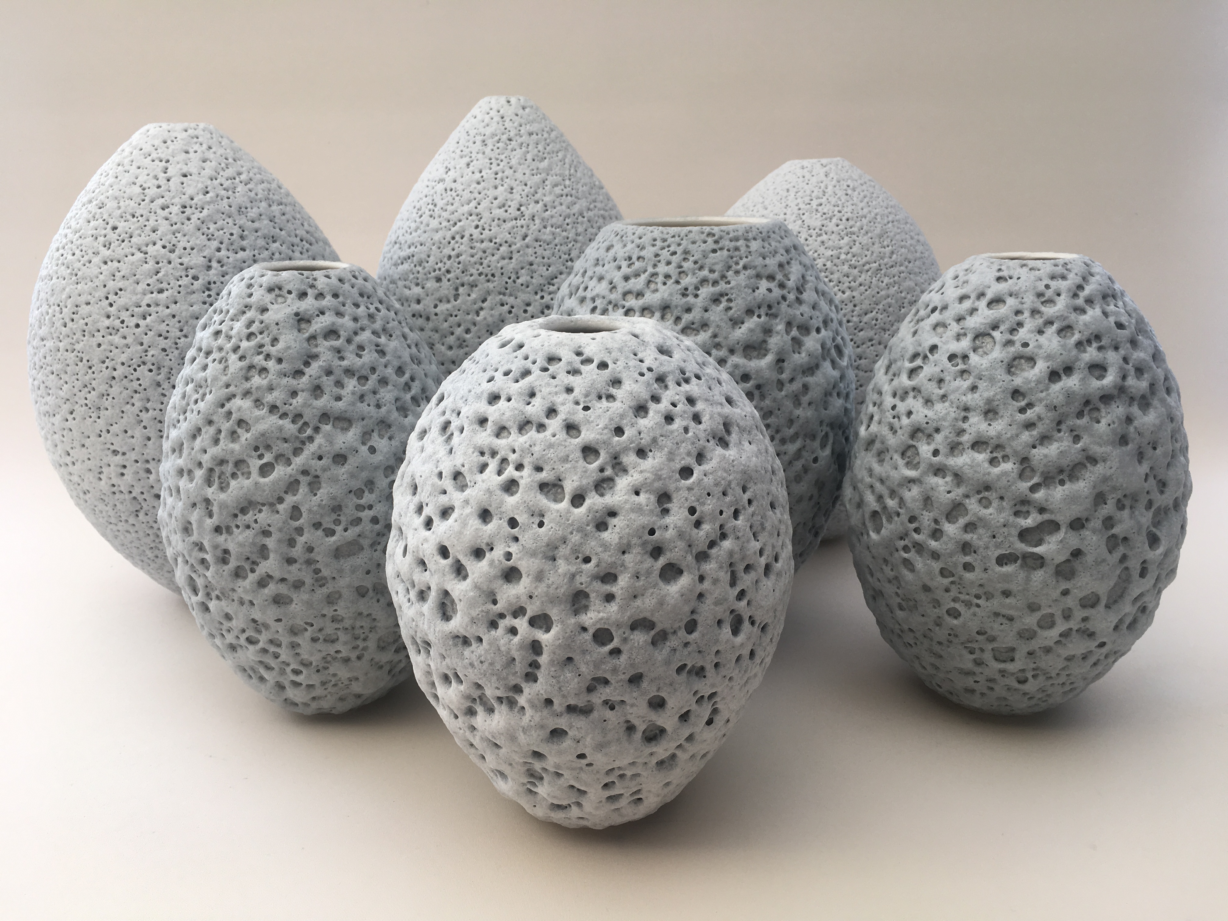
 The ultimate slip is achieved by putting the additive directly into the clay. I use this technique for pitted agate.
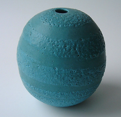
In later work I cut out the slip stage and mixed two versions of the glaze, the second with 3% silicon carbide added. Because I spray my glazes, I am able to spray the foot and grade upwards with the non-reactive glaze and then do the rest in the reactive. It achieves the same result as placing the slip and avoids pitting near the base. Yet using a slip is more precise, as it produces a definite cut off point.
The following two glazes are oxidised to 1220°C.
|
| |
| Potash Feldspar | 31 |
| Whiting | 20 |
| Talc | 10 |
| Kaolin | 29 |
| Silica | 10 |
| Zinc Oxide | 10 |
This was originally a Len Castle high temperature reduction glaze to which was added 10% zinc oxide to melt at a lower temperature
|
| |
| Barium Carbonate | 24.4 |
| Dolomite | 12.2 |
| Petalite | 12.2 |
| Cornwall Stone | 12.2 |
| Nepheline Syenite | 12.2 |
| Kaolin | 12.2 |
| Silica | 14.6 |
| Tin Oxide | 4.9 |
| Copper Carbonate | 3.5 |
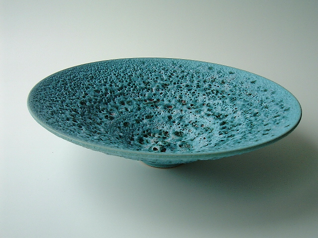
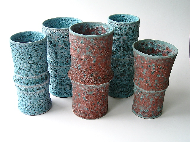
The reaction between the silicon carbide and the copper carbonate often produces local artificial reduction resulting in copper reds. If the froth is ground off, the red becomes more prominent.
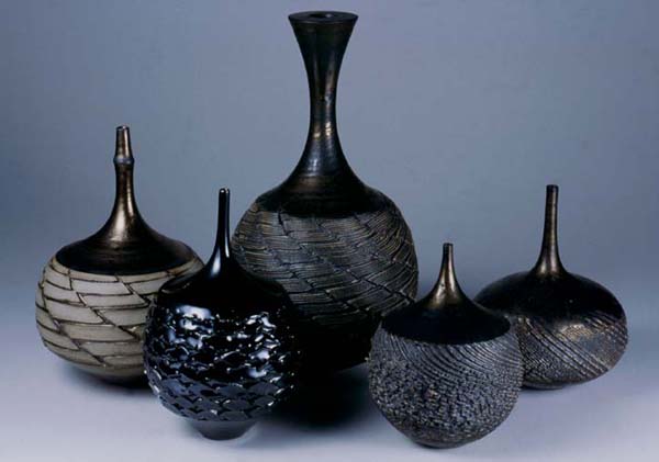
COMBED AND CUT WARE 1979+
I took a Warren Tippett wood-fired, combed porcelain, lidded jar to a night school class and, attempting to show off to the class, tried to make one. It was addictive and became a passion, complete with its own silly technical jargon.
The idea is basically simple. Make a cylinder, and texture it by combing vertically using a notched tool. Then open out the cylinder and the combing will form a spiral. The tricks we evolved were to make a thicker than normal cylinder, then remove the slurry and throwing ridges from the outside of the cylinder. (The throwing ridges conflict with the combing.) It is then important to clean all the slurry from the inside. After texturing, you must have completely dry hands as you want "to engage the drag" by having as much frictional contact between your flat hand and the clay. Bad throwing. As soon as you are happy with the twist, use a metal kidney with only the edge making contact—"disengaging the drag" to make the final shape. Then throw the neck, using conventional throwing if it is a bottle. I use the larger U-shaped golf umbrella spines inside narrow necks as a sixth finger. Once leather-hard, the neck is finely turned upright on the wheel and the base is turned routinely in a clay chuck.
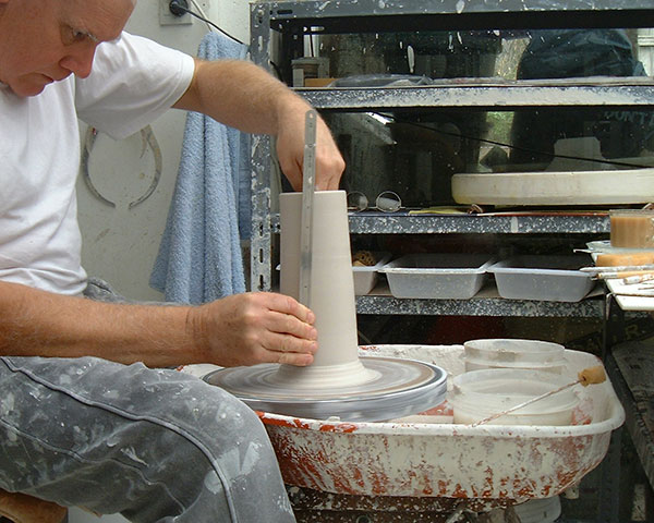
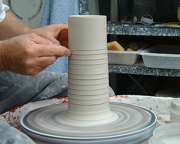
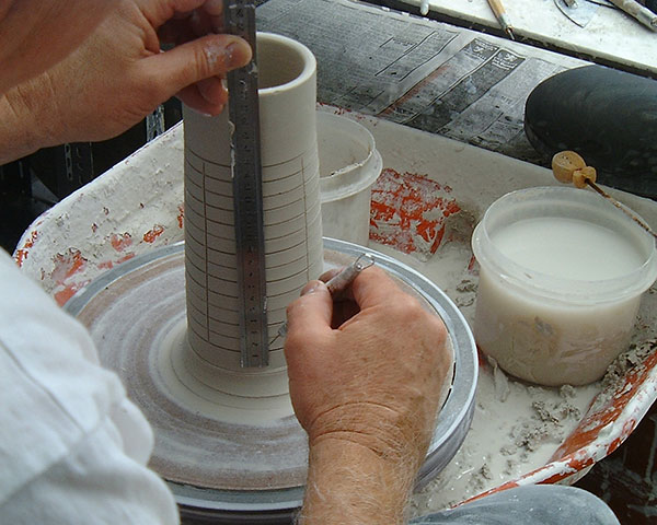
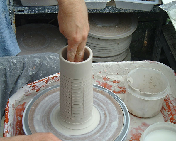
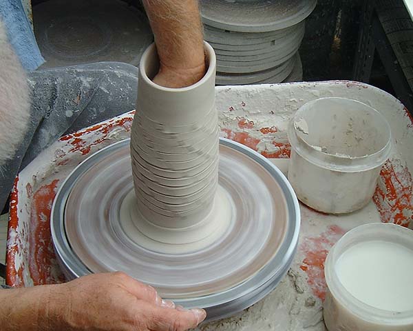
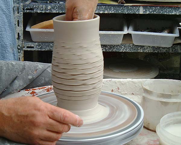
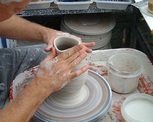
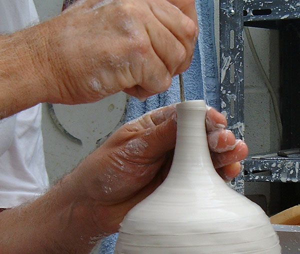
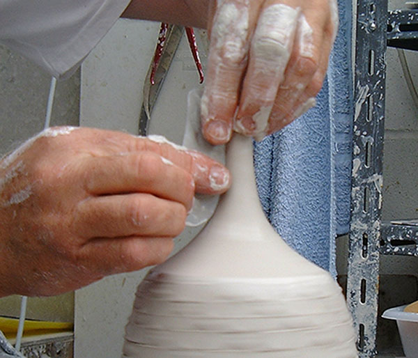

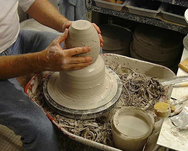
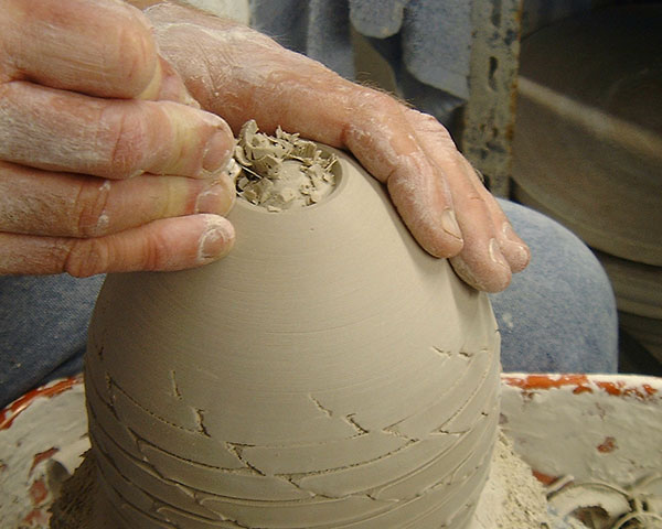
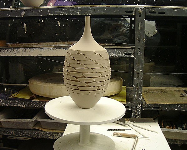
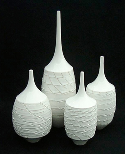
The best effects come from cutting deeply into the clay with a needle rather than just combing the surface. The cylinder needs to be thicker in order to cut deeply. Cutting produces a more mechanical or industrial rather than organic effect. Be prepared to lose a few pieces along the way.
HOBBY CERAMICS 1979
Bronwynne Cornish first wet my appetite for low fire glazes. She came back from the United States in the early 70s with some Duncan Crystaltone glazes and used them on her crashed butterflies and snakes. I went with Rosemarie McClay and Cecilia Parkinson to a Hobby Ceramics class in the early 80s. I wanted to learn how to glaze like wood-grain.
Hobby Ceramics® is a lucrative international business where you buy slip-cast green ware and learn how to fettle and then glaze, paying for the item, glaze and firing at each step along the way. The process was interesting and different to my usual way of working. Adapting the technique to my own ends, I threw and turned my own blanks and when dry, bisque fired them to their vitrification point of 1200°C. The glaze was then painted on in layers with a fishtail brush. The clay was no longer porous, but the bought containers of glaze had some glue or suspension additive, which dried quite hard. Three or four layers need to be applied, each in a different direction like using vinyl paint correctly.
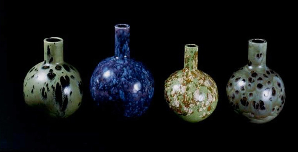
The crystal glazes have chunks of already fused glaze suspended in the wet glaze. You need to sieve these out for the first coats and add the chunks only for the final layer, which you can heap up a bit to seed larger growths of crystals.
I haven't yet made work using wood-grain glazes, but I have always planned a dream "Fakes" exhibition with work pretending to be made of other materials. Richard Shaw, Richard Notkin and Peter Lange do the super-realistic, still life, trompe l"oeil thing so well. I always get off on the deception when people think my stuff is made out of glass, concrete or metal.
BASE GLAZES 1980
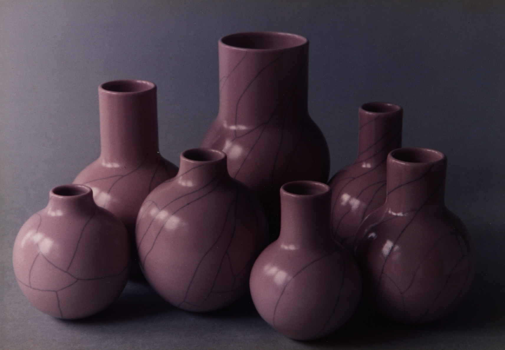
These base glazes were originally formulated for a Middle Fire Glaze course I taught at the Auckland Studio Potters Centre in 1980. The formulas result from averaging the ingredients of many published recipes from various sources. The idea was to find how many significantly different glazes there were by testing their responses to different colouring oxides and stains. The following results form the basis for all my recent glazes.
The maturing temperature has been progressively lowered from 1250°C to 1220°C.
|
| |
| Potash Feldspar | 43 |
| Silica | 24 |
| kaolin | 2 |
| Gerstley Borate | 20 |
| Whiting | 2 |
| Zinc Oxide | 3 |
| Barium Carbonate | 6 |
This glaze was later replaced by the commercially available Abbots' Clear.
|
| |
| Potash Feldspar | 43 |
| Silica | 24 |
| kaolin | 2 |
| Gerstley Borate | 20 |
| Whiting | 2 |
| Zinc Oxide | 3 |
| Barium Carbonate | 6 |
| Tin Oxide | 10 |
This glaze was later replaced by the commercially available Abbots' White.
|
| |
| Potash Feldspar | 31 |
| Whiting | 20 |
| Talc | 10 |
| kaolin | 29 |
| Silica | 10 |
| Zinc Oxide | 10 |
This was originally a Len Castle high temperature, reduction glaze to which was added 10% zinc oxide to melt at a lower temperature.
|
| |
| Barium Carbonate | 27 |
| Nepheline Syenite | 58 |
| kaolin | 6 |
| Silica | 7 |
| Lithium Carbonate | 2 |
| Alkaline Frit | 10 |
|
| |
| Barium Carbonate | 35-15 |
| Zinc Oxide | 15-35 |
| Nepheline Syenite | 25 |
| Lithium Carbonate | 5 |
| Silica | 15 |
| kaolin | 3 |
| Bentonite | 2 |
|
| |
| Cornwall Stone | 85 |
| Whiting | 15 |
This is the basis for crackle glazes.
PENETRATIONS 1980
I have always been keen on the graphic work of Swiss surrealist painter H.R. Giger who collaborated on the production design of the movie Alien. The idea of something growing out of another thing—of being the host of a much larger entity—is behind the Penetrations, which are suggestive of something nasty, toxic and lethal.
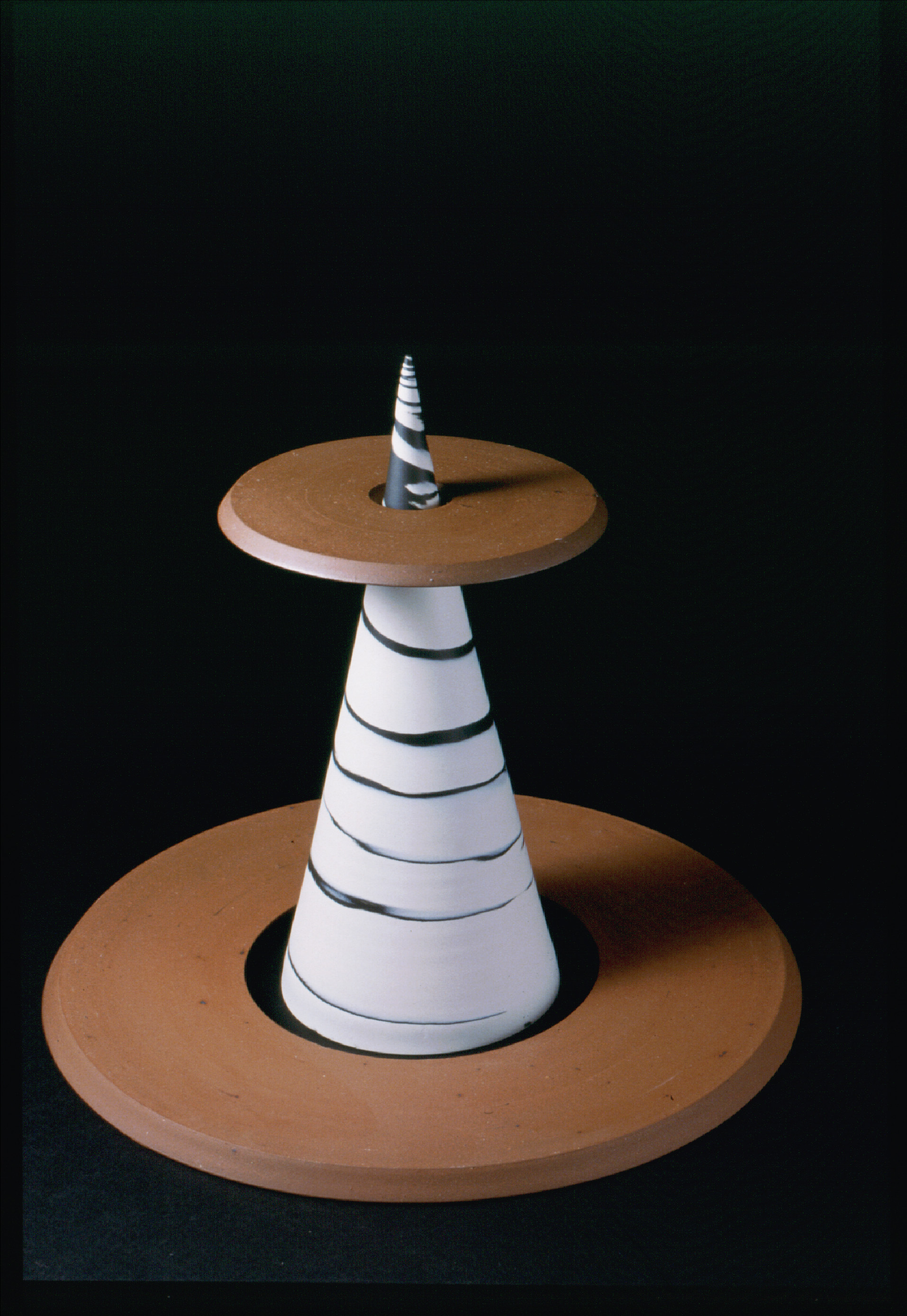
Despite the sexual, shock-value titles, the pieces originated simply from accidentally turning through the bases of bowls while inverted on the wheel-head. They are the only instance where I made work outside the category of traditional, functional, hand-thrown pottery. I was interested in playing around with all the usual principles of positive and negative space, as well as the severely contrasting elements of colour and form. It was also interesting to work with two pieces, which are co-dependent and which "function" through their interaction.
ELECTROPLATING 1994
The pieces were thrown and turned as per normal and once-fired to the top temperature of 1220°C. They were then electroplated with pure silver or copper, by immersing them in chemicals with the appropriate electric charge. The drawback was that electricity moves via the most direct path, so no deposits really occurred on the insides of pieces. The resulting texture was a thin layer of pure metal following every contour on the ceramic. Every vestige of the making process was preserved.
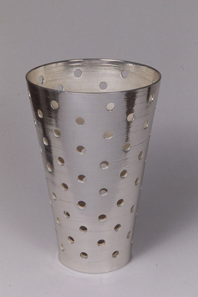
GOBO WARE 1991
The first perforated ceramic piece I ever saw was an African pot in the Auckland Museum. It was a kind of colander for separating curds from whey.
A gobo is traditionally a metal stencil inserted into a theatre lamp which breaks up the beam to project a textured light on the actors and set, creating, for instance, shadows of sun through Venetian blinds or the illusion of being under foliage. The holes I drilled into bowls allow a similar play of artificial light, but they also create an infinite set of variations in natural light as the sun shifts by day and alters its angle by season.
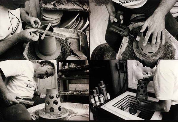
The pieces are thrown as blanks and then turned evenly when leather–hard, testing with a needle for thickness. The aim is to achieve an even wall thickness. The piece is then marked up using a ruler and protractor, and the holes are pierced with a tungsten-edged hole cutter in a portable electric drill. The rough edge is then sponged into a rounded shape.
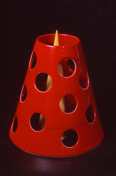
I am interested in an even placement of perforations, as if the pieces were stamped out of a sheet of uniformly perforated raw material, such as aluminium. Where I have played around with patterning the perforations, they become pieces about patterns, rather than something made out of stuff that has holes in it.

The Stud Bowls and the Safe Sex Toys have brass, rubber and stainless steel marine fittings filling in the holes.
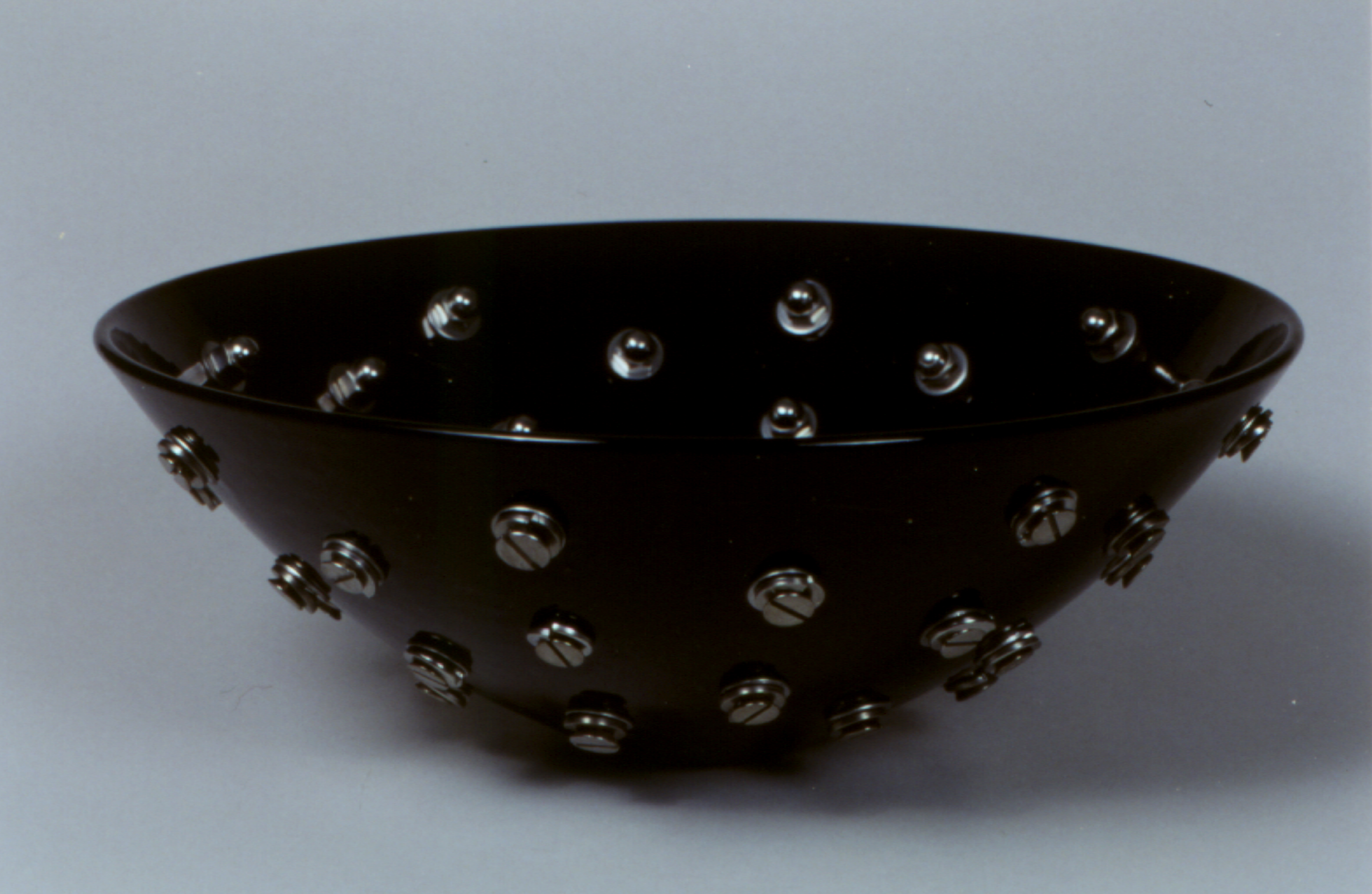
The first outing of Gobo Ware was my 1991 solo show to celebrate the move of Master Works to new premises in Parnell. The pieces used a single white glaze for the first time with a variety of textured surface treatments. Lighting designer Tim Dowson provided a changing lightscape which sequenced over ten minutes, effectively changing the colour of a piece in many ways.
WHITE WARE 1995+

I decided to identify this series by the descriptive label White Ware as a reaction against pretentious ceramics with names like Impressions of Nature—Part II. The generic title came from playing on the collective term for refrigerators, dishwashers and washing machines, and followed on from Vortex Ware in that it is produced by a loosely defined owner-operated factory from "within the Pottery Manufacturing Industry".
RIDGES, ZIGZAGS AND GROOVES
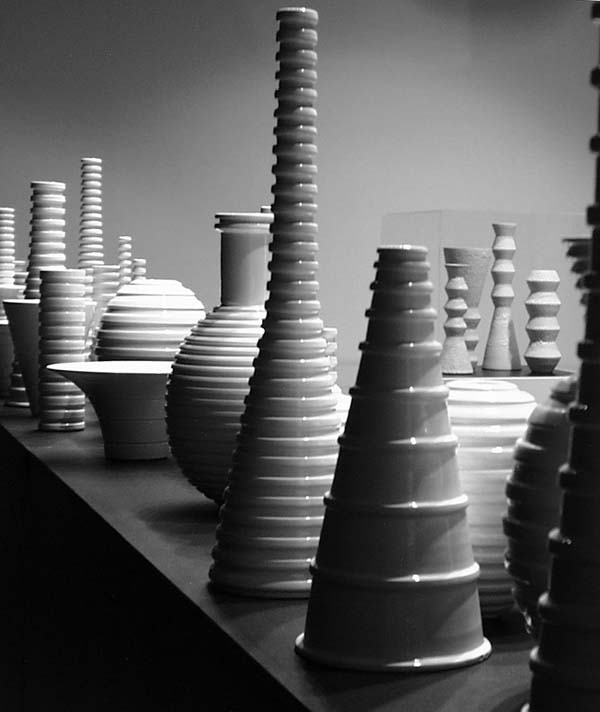
I have always responded to lathe turning after making a plumb bob in fifth form metalwork. An early edition of Glenn Nelson's Ceramics showed a guy turning a huge electrical insulator, and another guy throwing a piece upside down using gravity positively. They were my heroes. I responded to the idea of equipment specially made for a specific use. At the Royal College of Art we went on a School Trip to the Dickensian world of Stoke-on-Trent. Armitage-Shanks made urinals, but they also made one metre cubed acid vats 50mm thick that were raw glazed and once-fired after drying for a year. T.G. Green made the blue and white striped kitchenware by coating the white clay body in a blue slip, and then lathe turning the blue away to make the stripes. Industry took on a whole new meaning.
The "Hand Potted" labelled Crown Lynn pieces by Earnest Shufflebotham and the Wedgwood pieces, designed by New Zealander Keith Murray, I had collected, fascinated me because of their studio potterness made from within industrial factories. The pieces were made as blanks and then, when leather–hard, tapped onto a horizontal chuck and lather-turned with chisels much like a metal or wood turner.
The first ridges came out of teaching—I asked a student if the slight bumps on the sides of a piece were meant to be there and if so to make them more pronounced. My first Ridges were swoops and grew out of finger groove throwing marks left on a quickly thrown piece. They were turned to accentuate the bad throwing, thus recording the process—the underlying architectural structure perhaps. Bowls had the knob that often forms in the centre turned into a sharp point feature, like the concentric ripples in a high-speed photograph of a water droplet.
Finger ridges also became sharpened into concentric, pointed, triangular ridges. These were later expanded in scale into the Zigzag pieces, which owed much to the Brancusi ‘endless column’ idea.
I have always been a better turner and finisher than a thrower. Lucie Rie and Hans Coper introduced me to the idea of constructing a piece from smaller parts you could throw well. The necks were thrown as a number of diabolo forms, turned and then joined into a stack, when leather-hard. The join is always easier at the widest point. I use water, not slip on the leather-hard pieces—water evaporates, but slip shrinks. It is a Lucie thing.
The Grooves evolved through overlapping Venetian blind-type ridges through to making deep, regular furrows. The graded positioning of grooves are intended to give a false perspective, like the tapering of classical Greek columns.
POTTER'S MARKS

My potters marks are pushed into the clay when it is leather hard, before it is fired.
So the mark really only tells when the piece was thrown and turned.
This has caused confusion re dating work accurately, because I frequently work on a series of a particular form and bisque fire them for safety. However it may be some time, even years before I decide which glaze to apply. Then this is the moment when I consider the piece to date from.
The actual date of making is important for me as a code to track the use of different clay bodies and kilns used at the time.
1966 Freehand Sgraffito
appears as a continuous stroke with a cross bar on the "J". It is scratched directly into the underneath clay surface. Sizes vary but the mark usually takes up the whole base.
Mid-1966―1977 Plaster Seals
The cross bar on the "J" was dropped in favour of making the "JP" into a symbol (approximately 15mm square) like a branding iron. Placement is usually vertically as near the base as possible, or in the centre of the footring with unglazed pieces such as agate. Use of this type of mark began when I increased the turning of footrings.
1977 onwards Metal Type
Three versions of metal printer's type are used randomly according to the amount of visible bare clay. There are two font styles of "JP"(approximately 10mm square) and one of "JOHN PARKER" (4 x 30mm).
From 2002 to 2013, pieces are dated using a form of Roman numerals: a square to represent 'I' and a triangle to represent 'V'. This was later replaced by the classic letters I, V and X. And from mid 2013 I have started using non Roman letters as a code.
2013 Metal Type - JP XIII or JP H
2014 Metal Type - JP U
2015 Metal Type - JP O for NZ, OO for work made in Canberra and OOO for back in NZ.
2016 Metal Type - JP AA
2017 Metal Type - JP K
2018 Metal Type - JP R
2019 Metal Type - JP N
2020 Metal Type - JP Y
2021 Metal Type - JP S
2022 Metal Type - JP W
2023 Metal Type - JP D (backwards) plus %,U,B and Z for different clays
2024 Metal Type - JP D W
POTTER'S TOOLS
I use all the regular pottery tools, but I end up modifying most of them. It is basically just problem solving. If you can't do something you create a new tool that will do the job, such as the tool I created to make the Vortex "coils". Many solutions are the same as for working in wood or metal.
Metal kidneys, for example, come in fixed generic shapes and are often unsuitable for a specific application. I always buy the largest ones and cut them with kitchen snips into the curves I want. The early ones were thicker and made of flexible spring steel that rusted, but they were the best. I still covet a few and use them sparingly. I have never been able to find the raw material at a supplier to make my own. The newer ones are of stainless steel. They are thinner and don't rust, but sharpen themselves into dangerous razor sharp edges so I trim them back continually. The straight edges also curve through wear and require realignment. I also use various sizes of stainless steel rulers as long thin metal "kidneys".
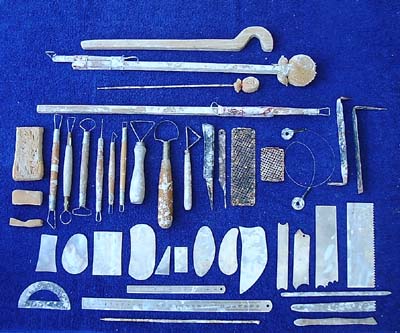
I use angled metal tools for turning, continually sharpening them. However, I mainly use metal strap loop trimming tools for turning. (The round wire sculpting loop tools are useless for my applications because they do not have a cutting edge.) I attach some of the metal strap loop tools to longer handles, for getting to the bottom of cylinders for example. The hardest trim to make is at right angles, such as reaching down from the top of a cylinder to trim the inside vertical sides.
I use U shaped golf umbrella spines as an extra long thin finger for closing in throwing of the narrow necks on bottles. The U shape lends strength, but it also provides a cutting edge for turning when leather-hard.